

0-1 project
I led the end-to-end design of a reimagined mortgage experience, that strengthened Moneybox's position in a growing market.

BUSINESS PROBLEM
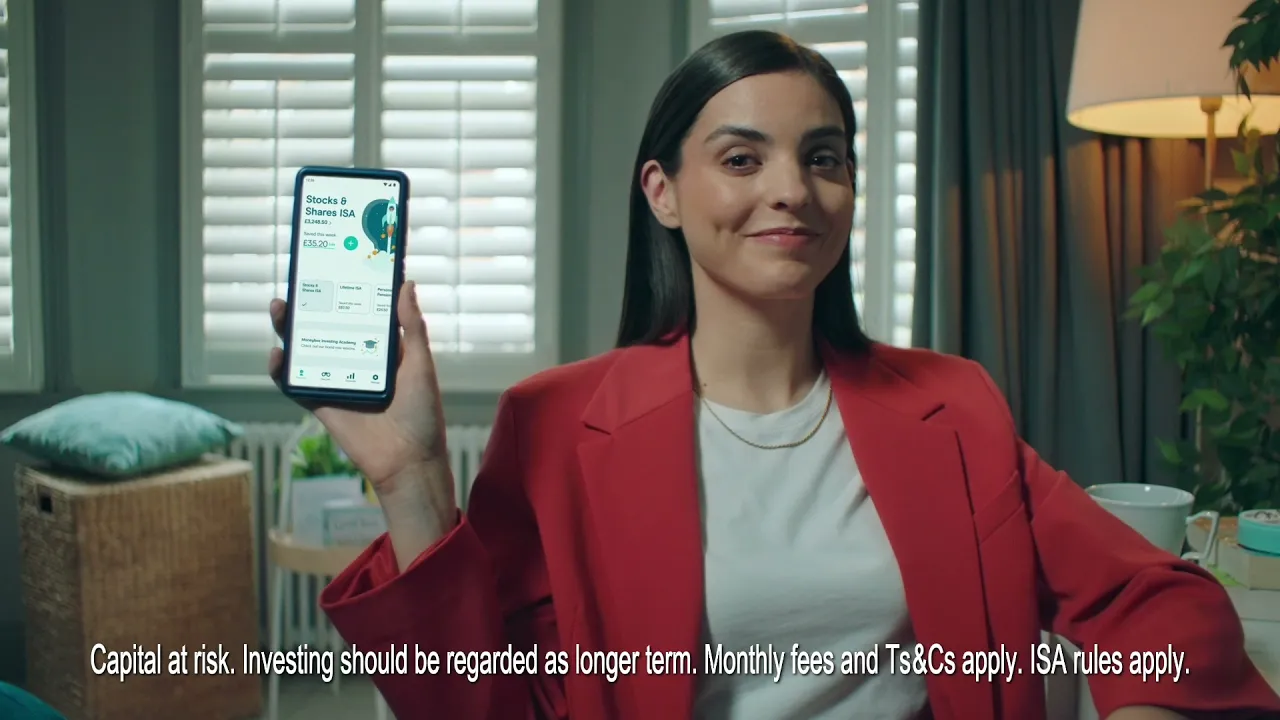
Moneybox is the UK’s top-rated app for first-time buyers, yet 97% of their users went elsewhere for their mortgage.
PROBLEM
Even though our service was free and rated 5 stars, people felt confused, frustrated, and unsure what to do next.

SOLUTION
To rebuild trust, I replaced a confusing process with an experience that made it easier for users to take confident action.

IMPACT
Leading to a 8.2% increase in applications, but more importantly, users finally feel confident about making one of the biggest decisions of their lives 🏡
Increase in mortgage conversions
Rise in MIP-to-chat completions
Increase in user engagement with next steps
The Mortgage Journey, Made Simple
PROBLEM
Reimagining the entire user experience from the landing page to simplifying the mortgage action steps

“It felt like the service was built for someone like me, not just mortgage experts.”
1.Transforming a complex journey into actionable steps
We broke the process into bite-sized, visual milestones that helped users understand where they were and what was coming next, building momentum and reducing decision fatigue.
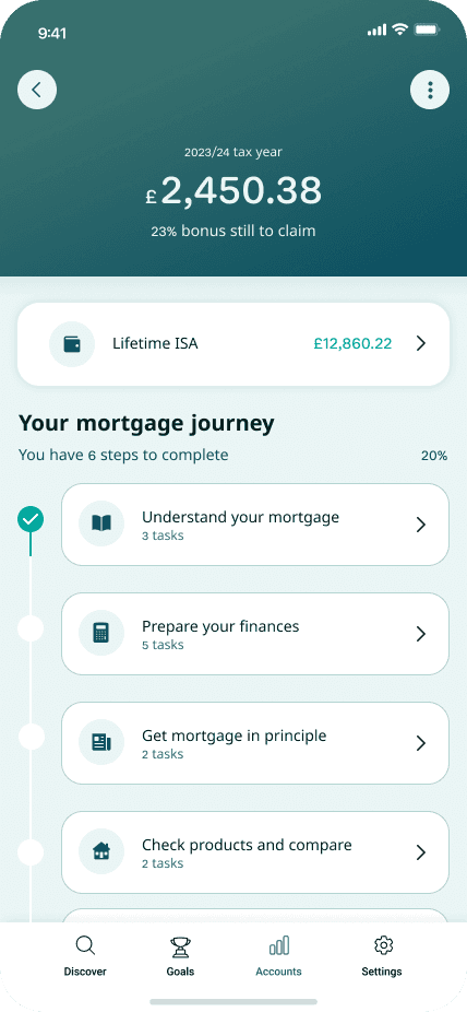


2.Making mortgages less confusing and intimidating
I replaced overwhelming call to actions with smaller, guided steps that felt achievable. This helped users feel confident move forward and less intimiated by the process.
3.Personalised support when it’s needed
I replaced generic info with personalised support at relevant stages so users felt supported without being overloaded.
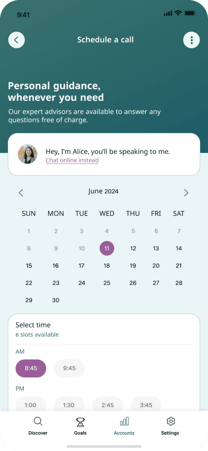
"It actually felt like the service understood what I needed and when I needed it, not just throwing tools at me."
Landing Page
Simplifying the Start
I simplified the landing page by prompting users pick their stage to get guidance relevant to them building trust and reducing confusion.
Clean First Impression
Removed excess content creating a clear, focused experience.
No More Clutter
Replaced generic info with clear, purposeful content for each user.


Stage-Based Guidance
Users self-select their journey stage for relevant, timely content.
Designed to Reassure
Helped users feel confident and in control throughout.
PROCESS
To start, I wanted to understand why so few people were using our mortgage service.
To kick this off, I led a stakeholder workshop to clarify goals and align on vision.
I designed the workshop with focused exercises to establish a shared understanding of project goals, the vision, and success metrics to ensure the team started in sync. This workshop helped highlight how large this project was and how we had to break it down into phases to ensure it could be delivered within the timeline

I audited the existing mortgage experience to pinpoint where users might get lost or confused.
The flow was messy, CTAs and tools were scattered. Users were expected to figure out the next step on their own, often without understanding the process or what stage they were in.

With limited data, I led an assumption mapping session with the team to spot what might be driving drop-off.
We mapped what we believed users were thinking and feeling at each point, and uncovered how much the experience relied on users already knowing how mortgages work, which most didn’t.

We needed to fill our knowledge gaps, especially around users emotions by speaking to them directly.
I ran a research alignment session with stakeholders to define what we needed to learn and get buy-in on research goals.
I brought stakeholders together to agree on the key research questions, so we could keep the study focused and actionable. The themes we agreed to explore further:
- Where users feel most uncertain or stressed
- What kind of support they expect from a mortgage service & broker
- How they perceive Moneybox compared to other providers
- Whether chat was the right entry point

I conducted 12 interviews with first time buyers to explore their mental models, frustrations, and expectations around the mortgage process
One key insight: users weren’t just looking for information. They wanted to feel reassured. Many felt unsure, even intimidated, by the idea of starting the process.

After the interviews, I analysed insights identify patterns, blockers and prioritised them with the team.
This analysis would help shape the design brief for this project and ensure we were solving the right problems. Some of the insights included:
- Users lacked confidence to start the process
- They didn’t understand what applied to them or what the next step was
- They expected more guidance, not just tools
- Starting with a chatbot felt impersonal and unhelpful
- Many wanted a human touch early on

With a clearer picture of user pain points and expectations, I created a focused design brief.
User need 2
As a user I only want information that is personalized and relevant to the stage I’m in
User need 3
As a user I want to feel confident taking the relevant steps to move through the mortgage process
Now the goal was to solve these problems in a way that delivered value to both users and the business.
I facilitated ideation sessions to help the team generate a range of ideas early on.
This helped us think beyond just displaying content and tools and into what a truly supportive mortgage journey could feel like.

I worked with our tech leads to review early concepts and understand build complexity.
This helped us narrow down options based on what could realistically be delivered in the timeframe.

I created a design assessment framework based on key findings from user research to evaluate ideas objectively
I led design critiques using this framework, helping the team evaluate and prioritize concepts. We used this during design reviews to choose which directions to explore further without bias and which ideas to park. I also ran SCAMPER design critiques with the product and stakeholder management team

I ran concept testing to test how well our top rated concepts met users needs
The feedback helped us confidently move forward with a direction that felt simpler, more human, and easier to act on, especially for users who were earlier in their journey.

What once felt stressful for users was replaced by confidence.

The experience became clearer, and we saw users moving forward.
(Detailed metrics remain confidential)
Increase in mortgage conversions
Rise in MIP-to-chat completions
Increase in user engagement with next steps

Add breakpoints to your blank page, then drop sections to have them responsive out of the box.
Get Started
Learn More